Wednesday, September 5, 2007

Digital Imaging- Collaboration

Our group worked well together. The first image we worked on was the collaborative piece that we simply took turns working on. We simply passed it around with no time constraints. Each person had a chance to explore and use a variety of materials. I focus my attention to the figures, I use it like an extension of my figure drawing class from the day before.
>
>
The next project was the was a collab piece that we took a 900x 900px piece and divided it into quads. Then each person work in a square of their choosing. This was interesting to see where the first person chose to work and then the second continued and made their sqaure a seperate but sort of continuation of the first. This piece had no time constraint.
>
>
The third project was another one of our collab pieces. This one we passed around similar to the first but we had a 5 min time limit. This one was interesting just to see how people seemed to work under the pressure of the time constraint and still come up with a piece that worked well together and all kept the same sort of abstraction. It look like some kind of ameoba type structure.
>
>
The fourth piece was our exquisite corpse. We chose a theme of ridiculous or just plain weird superheros. We then delegated the peices of the body: Head, Legs, Arms and Torso. I did the Torso peice with the idea of a person that has an angler fish mouth for a bellybutton. Then when all were finished we took a few minute to peice the body together.
>
>
The final piece was a individual piece. I look at this piece and see mostly a response to the first and third project. I incorporated more of the figure. I also played with the idea of something under the microscope.
>
>

Monday, August 27, 2007

Optical Art Research...

[The work of Victor Vasarely]

- This piece is interesting. Many pieces of Op Art simple, to just trick your eye that you are seeing a differnt space than the 2d image. This is showing an actually picture.


The zebra picture is really cool. It is made of of contrasting peices or organic shapes to make up the zebras.

I like the idea of the overlapping shapes in this piece. I don't really thing the colors work as well as the previous black and white pieces. I just don't feel the same amount of contrast in this one. I think that there are too many colors and it feels very muddled and less like op art. The sense of movement is also drown out by the colors.

I like the black and white work of Vasarely better than his colored work. I like that they are not the standard optical illusion that most picture when they think of op art.

[Things to explore based on Vasarely's work.]
-High Contrast, Black and white
-The use of an image potrayed through the illusion of the art, rather than just art itself.
-Overlapping of Shapes.
- Skewing of shapes.


[The Work of Bridget Riley]
I like Riley's work, it all seems fairly dramatic and high contrast.[left] I also like the use of gradation with the blocks of color to add to that contrast. [below]


[Things to explore based on Riley's work.]
-High Contrast, Black and white, again but perhaps bring in contrasting color.
-Overlapping of Shapes.
- Skewing of shapes.
- The gradation of color.


Another brief note: I would like to explore the idead of moving op art. These works not only seem to create space in 2d but they look as though they are moving. [below]


Tuesday, August 21, 2007

Monday, April 9, 2007

Portfolio Crit...

Karen C. Rhines Portfolio is what I chose to critique because I like her art. The site is easy to navigate. Everything is clearly labeled.Everything is also easy to read the text color are easy to read with the background. Every page is connected and you can get back to the home page. The images are fairly large. Which is go so you can see the art. I also like that everything has thumbnails. She provided a small bit of information about herself as well as contact information. She also has her art seperated into categories including a section for new stuff.

The only thing that I don't like is that the links could maybe be presented in a better way. The other thing is that some of the pages don't fit in the standard screen and it is hard to appreciate some of the quality of the art if you can't see it all at once.


http://www.kcrhine.com/

Wednesday, April 4, 2007

Maya Project

Heather,
First of all feel better.
I know my lighting is kind of dark right now I can light the object but can't make the atmosphere lighter and on the fourth one I couldn't figure out how to make each of the square images different.
-Erika


Wednesday, March 14, 2007

Sculpture Research

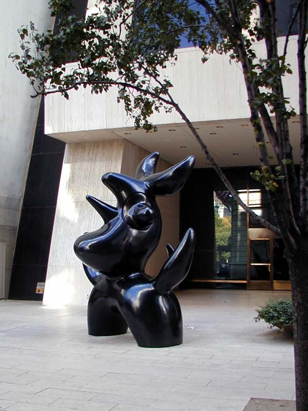
Joan Miro


I like Joan Miro's work because there is a distinct style the the shape of the peices and the surface area is well thought out. On one there is colot that is placed specifiically and the other is dark and smooth looking, there is a lot of consideration to the texture as well as color in regard to the form.


Nancy Holt


I love the form of these sculptures the first one especially has great movement and seems to have this sense of pushing boundaries like the metal is flowing in the wind. The second it very interesting in that it looks like an abstract bird cage.


Eva Hess


I like these works because I like the idea of repetition and how they are repeated but not necessarily the same shape. I also like the rope because of the sense that it is defying gravity and that can definately be done in the digital world.

Alberto Giacometti


Giacometti is also dealing with repitition and abstraction of figures.

Archipenko


I like thes for the same reason as i like Joan Miro. The are very paticular in color placement and the are also more like abstracted figures.

Tuesday, January 16, 2007

Digital Self Foundations


Personality


-[Reserved, Quiet]


-[Blank, Palette to Build upon]


Cindy Sherman Influences


-[ Emerging (action)]


-[ Black and White]