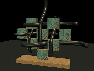
First of all feel better.
I know my lighting is kind of dark right now I can light the object but can't make the atmosphere lighter and on the fourth one I couldn't figure out how to make each of the square images different.
-Erika


Blog For Digital Art Class... 07-08 Intermediate Animation and Interactive Media
1 comment:
Erika,
You can change the environment / background color by going to the Camera Attribute Editor settings: there you will see a tab called “Environment” where you can change the color – I think that will help. Also turn your shadows on in your lighting and try more exciting lights (spots/directional); Are you using just one light? If so, try adding a second one. Only one needs to cast a shadow. Your color palettes on the models are good and consistent.
#1: need cast shadows; perhaps reduce the contrast in the marble texture on the ground (more similar values in the colors); need to see more detail in the black – try adding a light in the front with a low intensity just so we can see the details in those forms; good composition otherwise
#2: Interesting sculpture, a lot of dynamic tension! Perhaps increase the transparency on the orb, and move the camera back slightly to not crop off the spires on the top, otherwise a good composition: you could try to add a complementary color for the environment/ground plane so that the sculpture pops more.
#3: I think you could zoom in a bit more on this one – I’d like to see some of the details in the ramp and the orb; again, try a contrasting color for the ground to have a nice pop with the blues; We’re not sure if the orb is floating or attached from this angle, if its important we know this, change the angle slightly to reveal more.
#4: Great model, but very flat lighting – add a cast shadow (which could work beautifully with the curves of the lines here); Get rid of the wood grain – it always looks bad because its hard to map properly on the objects; I think you should brighten up the environment here (lighter background and ground plane) to make it pop more; shift the composition slightly so that cropped vertical isn’t perfectly centered,
#5: This is a bit flat with the lighting, which makes us lose the lovely texture of the fish; Should the fins be more transparent, almost like cellophane? Also should their surface be more of a Blinn instead of a Lambert? Composition is too centered. A spot or directional casting a long shadow behind could make a dynamic image.
Post a Comment